Project 03 flitz UX/UI Consulting

flitz App Redesign — a student platform, rethought.

The flitz project was about redesigning a student app for day jobs and exclusive deals — with the goal of improving the user experience and increasing user acquisition. Focus: user-journey optimization, leaner registration processes and benchmarking against best practices.

The redesign shortened the registration process by 1:16 min on average and noticeably reduced drop-offs.

Role UX/UI Project Lead
Timeframe 07/2019 – 10/2019
Platforms iOS · Android
Areas Strategy · UX/UI Design
flitz App Redesign — cover
01 — Background

A start-up on a growth path — with a UX that had to grow with it.

The decision to revamp the flitz app's user experience was driven by a clear need for growth. flitz — a German start-up connecting students with day jobs and exclusive deals — had already built a solid user base. To attract more new users, design and usability had to be sharpened. In my early steps as a UX designer, I worked with the team to develop a new app concept that would optimize the entire user journey.

Note: The company flitz ceased operations in 2020.

The focus was on analyzing the existing user journey, identifying pain points and developing solutions that make the app more intuitive and engaging. We analyzed feature utility, improved usability and made recommendations for the visual design — for a seamless experience that meets user expectations and supports the company's growth strategy.

02 — Approach

A systematic UX approach — from analysis to prototype.

The project followed a systematic approach based on UX methodology. Each phase built on the findings of the previous one — from analysis through ideation to an interactive prototype.

  • Analysis An in-depth user-journey analysis to identify pain points in the existing flitz app. Together with user feedback and benchmarking against market best practices, this created a solid foundation for improvement.
  • Ideation Brainstorming and ideation workshops with the client — with strong agreement on the proposed solutions. We then developed wireframes for the entire user journey in Adobe XD, focused on usability and the identified pain points such as registration and payment.
  • Prototyping From the concepts we built an interactive prototype that visualized and made the new flows testable. Iterative feedback loops with internal and external stakeholders ensured user needs and business goals were consistently met.
Annotated structure tree with 90 wireframes of the flitz app

"Before the redesign, 46 % of all users abandoned registration."

— Starting point of the user-journey analysis

03 — Outcome

From abandoned sign-ups to a measurably better onboarding.

The flitz app redesign successfully addressed the central pain points from the user-journey analysis. Before the redesign, 46 % of all new users abandoned the initial registration process. Through streamlining and usability improvements, the average time to complete registration was reduced by 1:16 min.

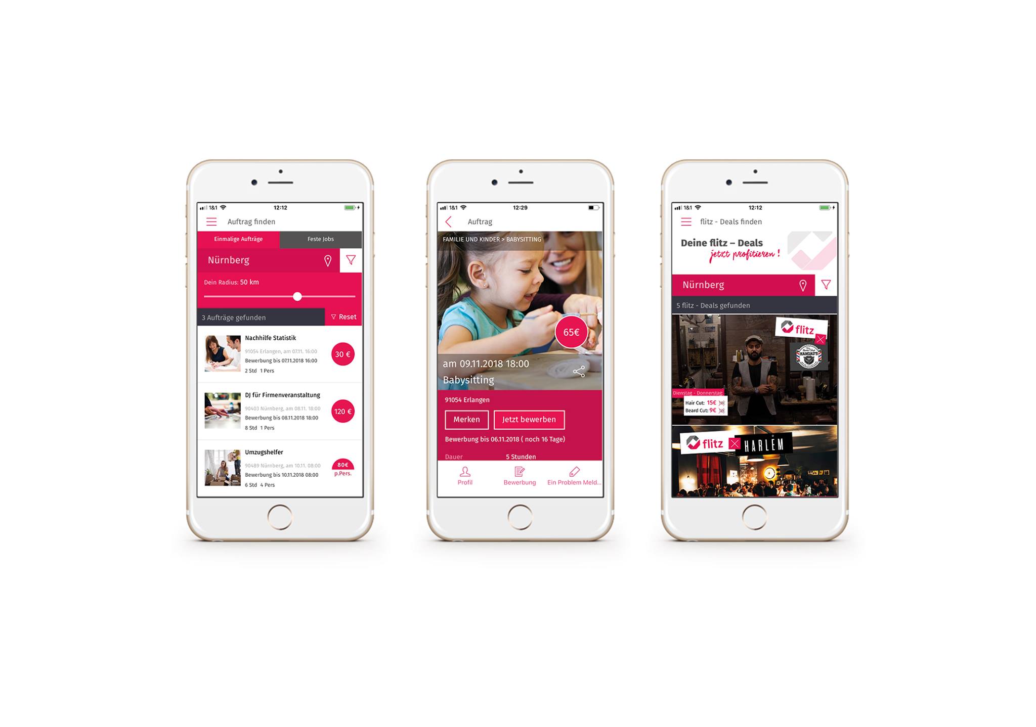
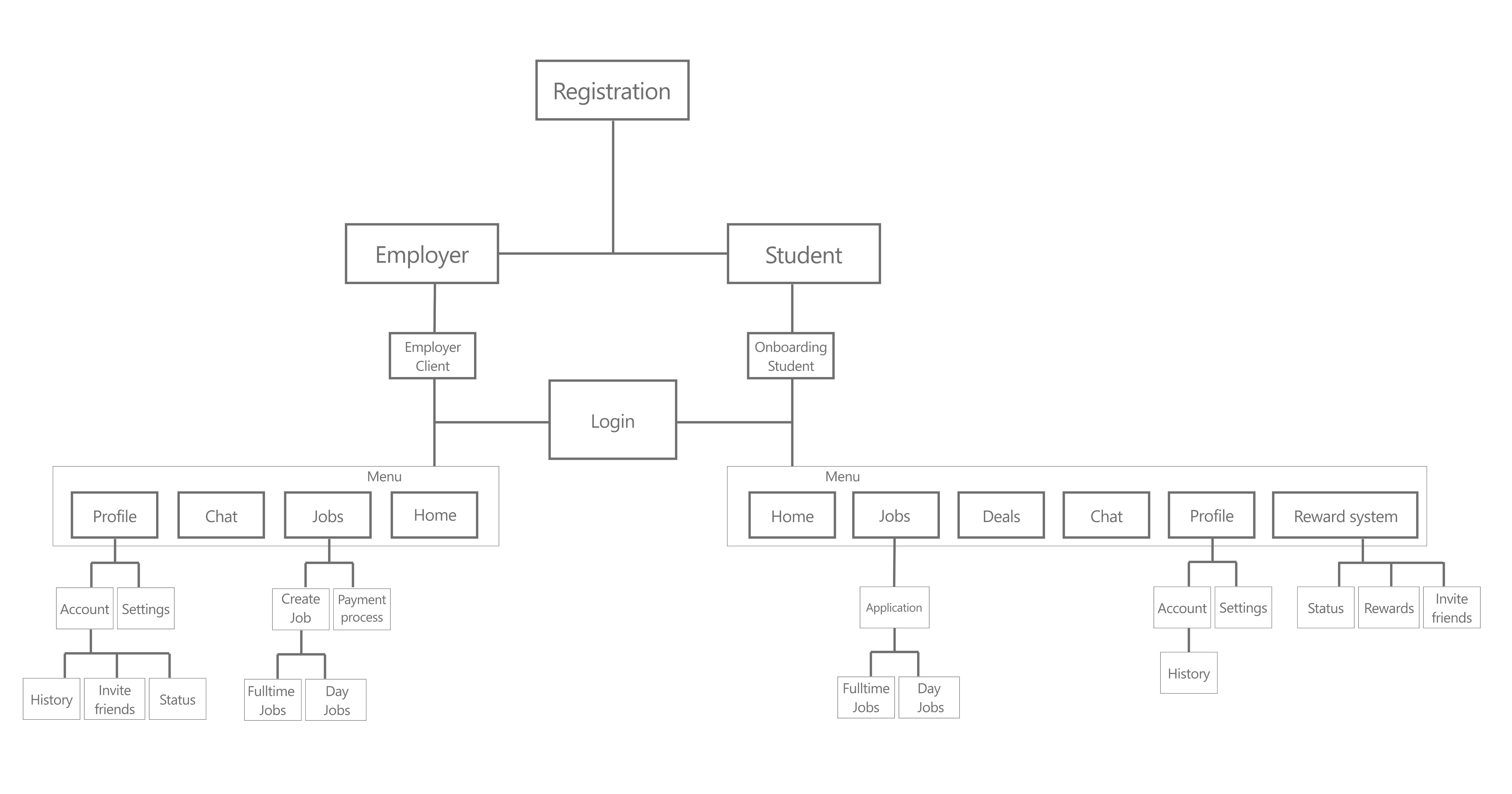
The final deliverable comprised a fully annotated structure tree with 90 wireframes and software specifications — including all improvements to navigation and user flows. These optimizations positioned flitz to better reach new users and noticeably improve the onboarding experience.

The changes increased usability and user satisfaction — and laid the foundation for stronger growth in user acquisition. The client especially valued the thorough documentation and the iterative feedback process, which ensured alignment between user expectations and business goals.

−1:16 min
Shorter registration time on average
46%
Registration drop-offs in the old flow — the starting point of the redesign
90 Wireframes
Fully annotated structure tree as the final deliverable
Back to the start Bosch Mobile Access